Maps can illuminate our world; they can enlighten us and make us see things differently; they can show how demographics, history, or countless other factors interact with human and physical geography. But sometimes, maps can be utter disasters, because they’re either wrong or simply very dumb. Here is a collection of maps so hilariously bad that you may never trust the form again. Tellingly, the bulk of the collection comes from cable TV news.
27 hilariously bad maps that explain nothing


Sean Gallup/Getty
Maps so bad they’re great
1) The Wall Street Journal’s election map

In 2012, President Obama won reelection, and the famously conservative Wall Street Journal opinion page was outraged. Alongside an editorial downplaying Obama’s victory, they printed this map of the election results — which surely looked great on the full-color layout computers, but did not translate so well into black and white.
2) The wrongest world map ever published?

Map nerds on Reddit spent hours trying to figure out what is going on with this map, or even where it came from. There are no answers, only baffling wrongness. The US is shown encompassing Canada and most of Central America. France has expanded into Belgium and the Netherlands. Germany has simply relocated to West Africa. China has reverted to the Qing dynasty flag. Who can even tell what happened to Turkey or India. The more you look, the wronger it gets.
3) How far away is Ohio?

This map, a 2009 creation by @drewtoothpaste, is one of the great viral maps of our time. Its utter uselessness is precisely the joke; something can meet all the technical requirements of an internet data visualization and still tell you absolutely nothing of value.
4) Super Bowl wins by country

American greatness, in one map.
5) A great map for trolling Russia

The official Canadian delegation to NATO has one of the diplomatic world’s more active social media teams. In August 2014, as Vladimir Putin insisted that any Russian troops in Ukraine had simply gotten lost and wandered into, rather than deliberately invaded a sovereign nation, the @CanadaAtNATO account tweeted this map with the message, “Geography can be tough. Here’s a guide for Russian soldiers who keep getting lost & ‘accidentally’ entering #Ukraine.”
6) An inscrutably blue map of dance songs

When the dance music site EDM published this map of the top Pandora dance tracks by state, it went with blue for everything, because who doesn’t love blue. It’s a great map if you like looking at the color blue and not so great if you want to actually match up the songs, many of which appear to be labeled with the same shades, with corresponding states.
7) The only map that matters

Like the Ohio map, this has flown around so many times that sourcing is impossible. But whoever made it has perfectly captured the spirit and significance of a good snow day.
Hilariously wrong maps
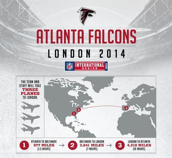
8) The Atlanta Falcons fly to London

There is so much to appreciate about this map I hardly know where to begin. The flight from Atlanta to London does not require three planes, it requires two. It is not clear that the numbers on the bottom correctly correspond to the numbers on the map. And, finally, London has been moved to Spain.
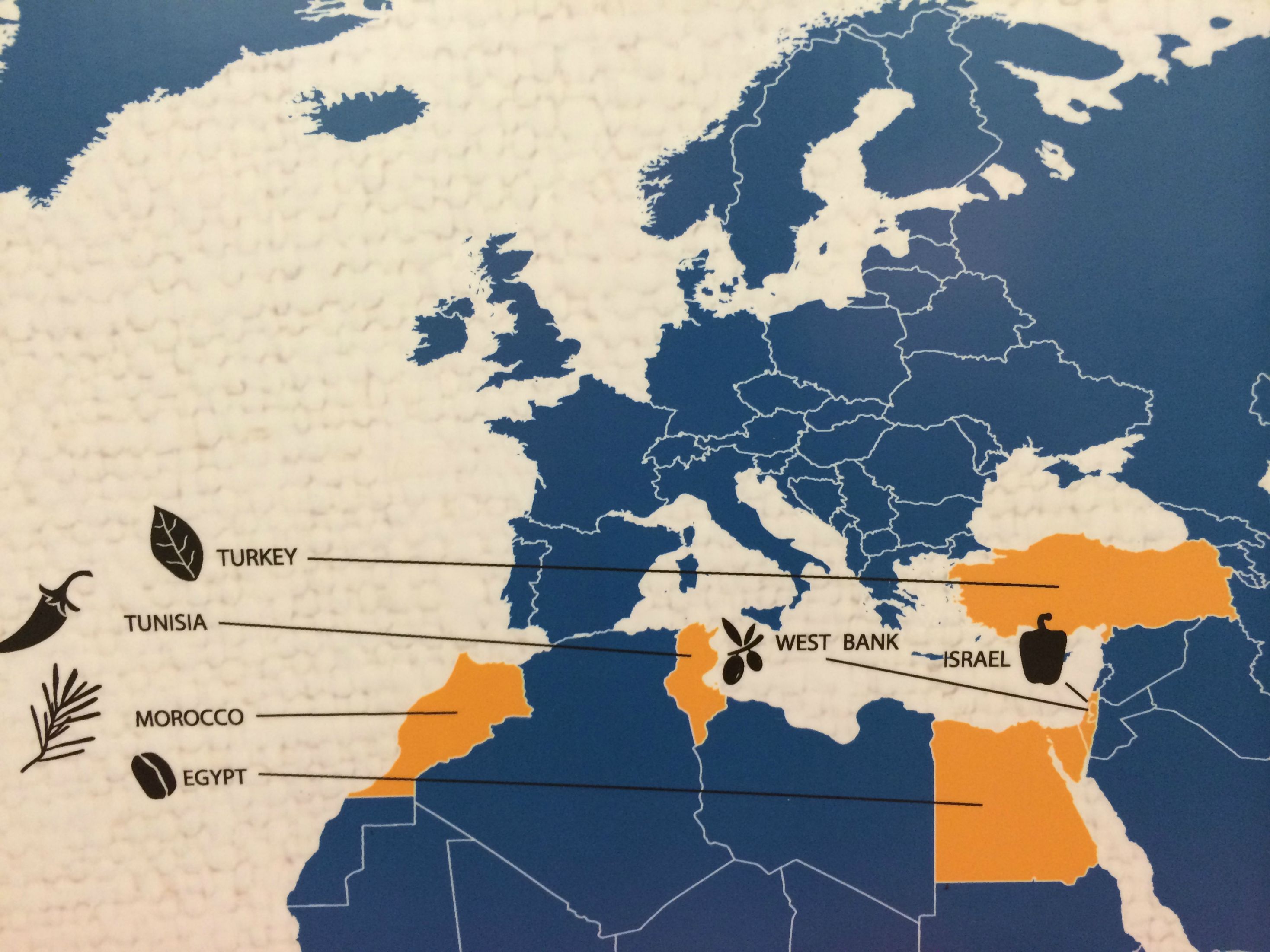
9) The Middle East according to a British tabloid

Amazingly, Kobani appears to be almost correctly identified on this British tabloid’s Middle East map that gets just about everything else wrong. Syria appears to have taken over Iraqi Kurdistan. Iraq, meanwhile, has annexed Jordan, Israel, the Palestinian territories, and parts of Syria and Lebanon. It’s Sykes-Picot all over again.
10) Whole Foods reshuffles Europe

Not since Napoleon have the borders of Europe been so dramatically redrawn. This map, which appeared in many Whole Foods locations for far longer than is understandable, has sunk the nations of Belgium, Luxembourg, and the Netherlands into the sea. It has also shifted Spain and Portugal into the middle of the Mediterranean, forming a land bridge between France and Algeria, destroying hundreds of miles of great beaches in the process.
11) The Los Angeles Times hates France

The newspaper’s Francophobia finally reveals itself in this map, from which France has been simply deleted. Also, make what you will of the strange country labeling here, from the inexplicable annotation of Mongolia to the fact that all labels are for countries except for “Africa.”
12) The Guardian annexes Ireland

In the course of an otherwise excellent series of infographics on how Europe has changed since 1960, the liberal British newspaper appears to have finally realized the dreams of so many English imperial revivalists and annexed the entirety of Ireland to Her Majesty’s rule.
13) A shopping mall’s guide to Mexico

A Reddit user says he found this map in his local shopping mall. Who wouldn’t want to buy what it’s selling?
14) A Brit tries to label the United States

When BuzzFeed asked a group of Brits to fill out a map of the US, this was one of several disastrous attempts. This tracks with my experience: The redcoats can typically place California, Texas, Florida, and maybe Alaska immediately; they have a vague sense of New York and Chicago; the rest is a total blur. You’d think they’d at least remember Massachusetts from Boston Harbor, the watery grave of so much beloved English tea. Do check out BuzzFeed’s excellent series of these: on the US, Canada, and Europe.
15) An Australian tries to label the United States

This 2013 map, the original “foreigner tries to label the states” viral gem, has some great details to it: the profusion of Virginias, for example, and the inclusion of “Left Canada,” which almost makes the rest forgivable.
16) A bunch of maps Vox made with a third-party service

Vox.com has found the Germany-based Datawrapper to be an invaluable service for helping writers create some of the maps and charts we run on our site, but unfortunately it has a bug that causes US state maps to show Ohio projecting awkwardly across Pennsylvania and stabbing New York. All things considered, Datawrapper is a fantastic service, but we couldn’t call out erroneous maps elsewhere without confessing our own sins. (Datawrapper is working on fixing the issue, and we’ll fix our maps once they do.)
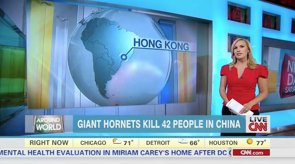
17) CNN goes to Hong Kong

In fact, that appears to be the Brazilian city of Sao Paulo, which as of this writing is fortunately not under attack by giant killer hornets.
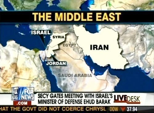
18) Fox News goes to the Middle East

The network that was so eager to invade Iraq has mislabeled it as Egypt.
19) MSNBC reunifies Czechoslovakia

The citizens of independent Slovakia are in for a surprise.
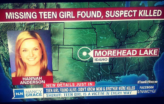
20) CNN’s Nancy Grace goes to Idaho

That’s Oklahoma, Nancy!
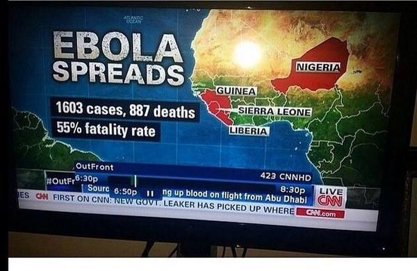
21) CNN goes to Nigeria

That is actually Niger, an entirely different country.
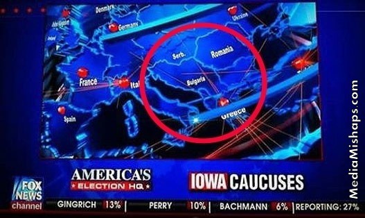
22) Fox News reunifies Yugoslavia, calls it Bulgaria

Years after Yugoslavia broke apart into several independent nations, Fox News has put the pieces back together. In a twist, the network has called it Bulgaria, which was never even part of Yugoslavia. As a bonus, neighboring Hungary has been renamed Serbia, which was part of Yugoslavia.
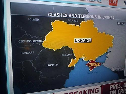
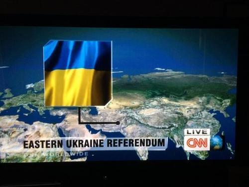
23) CNN goes to Ukraine

That is Pakistan, CNN. It’s not even the same continent!
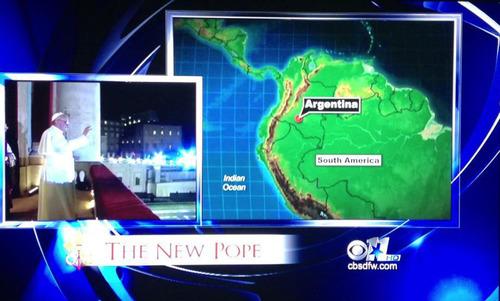
24) CBS goes to Argentina

CBS has moved the pope’s home country of Argentina to the faraway and much smaller Caquetá region of Colombia. Okay, so this is a local affiliate of a network news channel, not cable news, but we’re including it anyway.
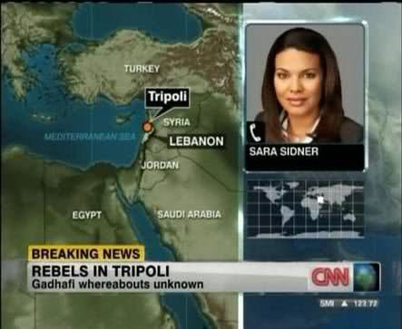
25) CNN confuses Libya with Lebanon

Tripoli, the capital of Libya, is on a totally different continent from Tripoli, the city in Lebanon. Although it certainly would have been big news if Libyan leader Muammar Qaddafi had hidden out in Lebanon.
26) CNN relocates France

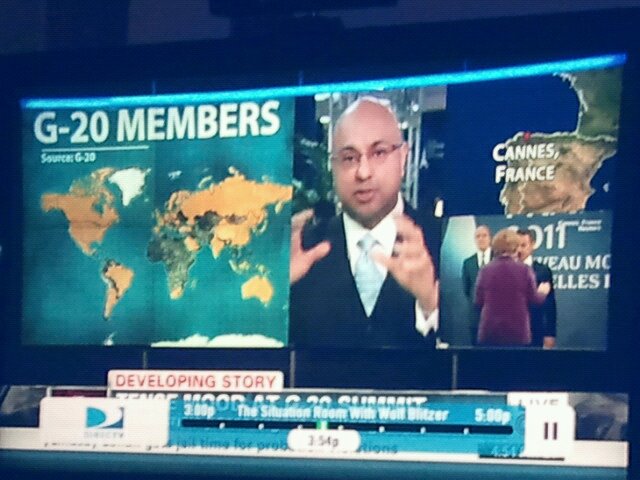
Cannes is a French city on the Mediterranean coast. It is displayed here as located on Spain’s Atlantic coast, because of course it is.
27) CNN looks for MH370

I initially thought it would be too nitpicky to call out CNN for mislabeling Kuala Lumpur, which is the capital of Malaysia, as a city in the entirely different country of Indonesia. Then I realized this was from its extremely over-the-top coverage of the search for a Malaysian airlines flight that had gone missing, and I decided it was probably fair game.
Learn more
Credits
Writer Max Fisher
Developer Yuri Victor
See More:
Most Popular
- The Supreme Court will decide when the police can use your phone to track you
- Pete Hegseth’s spiritual leader explains his radical faith
- Take a mental break with the newest Vox crossword
- Israel’s critics are winning the battle for the Democratic Party
- Why it feels like there’s never enough time for your relationships


